

Material Design 3
Google's design system, now with M3 Expressive. Reference for components, color roles, motion and Android patterns.
References, token tools and color scale generators for the people who build and maintain design systems. Research how other systems name and structure components, manage tokens between Figma and code, and document decisions clearly.
Study how mature systems structure foundations, components and usage guidance.
Google's design system, now with M3 Expressive. Reference for components, color roles, motion and Android patterns.

Apple's official guidance for iOS, iPadOS, macOS, watchOS and visionOS. Check it before designing any native Apple experience.

Atlassian's foundations, components and content guidelines. A strong reference for dense, collaborative SaaS interfaces.

IBM's open-source system with deep usage guidance, data viz and Carbon for AI patterns for chat and agent experiences.
60 components compared across 95 design systems, with 2,600+ examples. Research naming and patterns before you spec one.
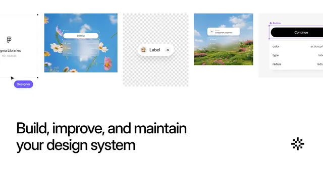
Searchable gallery of real design systems, components and foundations, plus articles. Pro adds templates and audit tools.
A free hub of blogs, tutorials and podcasts on how design systems work and how to build one.
Build color scales, set a type scale and manage tokens so they map cleanly to code.
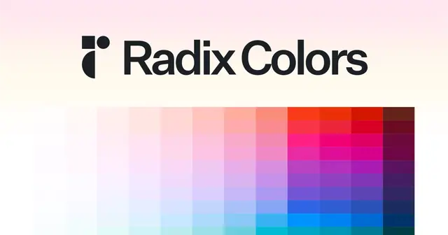
Generate a full Radix-style color scale from your brand colors and preview it on real UI.
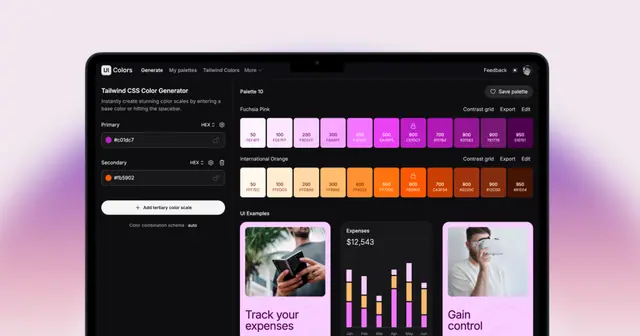
Generate Tailwind-style shade scales from a brand hex and preview them on real UI components. Includes a Figma plugin.
Generate tints and shades of any color to build out your design system's palette.
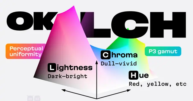
Evil Martians' OKLCH picker and converter with P3 gamut preview and sRGB fallbacks, for perceptually even palettes.
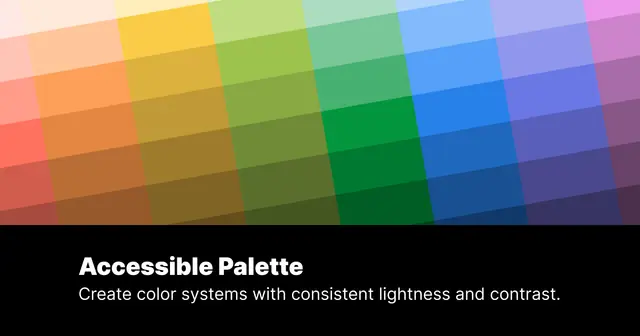
Builds color scales with consistent perceived lightness in CIELAB/LCh, so contrast stays predictable across shades.
Figma plugin and platform for managing design tokens and syncing them with GitHub and code. Built for multi-brand systems.
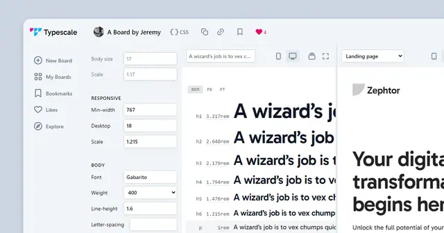
Build a modular type scale from a base size and ratio, preview it with real fonts, and export the CSS.

Handoff and documentation layer: publish screens from Figma and developers get specs, assets, styles and code snippets.
Keep your Figma library aligned with the components and icons engineers actually ship.
Open-source React components on Radix/Base UI and Tailwind that you copy into your codebase. The baseline for most SaaS UIs.
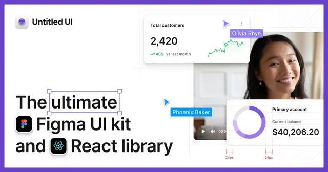
Figma design system with 10,000+ components and variants, a matching open-source React library and an icon set.
150+ free animated React components built with Tailwind and Motion, designed as a companion to shadcn/ui.
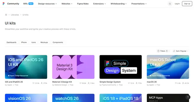
Thousands of free and paid UI kits on Figma Community, including official kits from Apple, Google and Microsoft.

Open-source stroke icon set (1,800+ icons, ISC license) with packages for React, Vue, Svelte and more. The default icons in shadcn/ui.

Flexible open-source icon family in six weights, thin to duotone, with Figma plugin and React, Vue, Swift and Flutter packages.
Search 170,000+ open-source icons from 200+ sets in one place, with each set's license shown. Also available as a Figma plugin.
450,000+ assets across 40+ consistent icon families, from minimal Core to hand-drawn Freehand. Free sets plus Pro.
Build accessible defaults into the system so every product team inherits them.
W3C's filterable list of every WCAG 2.2 success criterion with techniques. The source of truth for compliance checks.

Community-run accessibility checklist, patterns and resources in plain language. A fast first stop for a11y questions.
Accessibility nonprofit with practical articles, a contrast checker and the WAVE evaluator. Use it to test and explain issues.

Accessibility suite with Figma and Sketch plugins and browser extensions for contrast checks, vision simulation and audits.
Checks text contrast with APCA, the perceptual model developed for WCAG 3, with guidance tied to font size and weight.
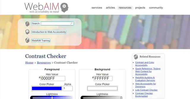
The reference WCAG 2 contrast checker. Enter two colors and get AA/AAA pass or fail for normal text, large text and UI.
Write guidelines teams will follow, and keep building your own systems skills.

Mailchimp's public voice, tone and writing guide. A proven template when defining product copy standards.

Microsoft's guide to clear, friendly UI text, from error messages and word choice to bias-free language.

Product copy management with AI drafting and style-guide checks, plus an MCP server for AI coding tools.
Live, hands-on bootcamps in UI, UX research, design systems and AI design engineering, taught inside real tools.

Figma's official courses, from Figma Design for beginners to design systems and prototyping.
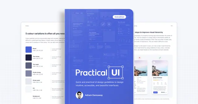
Adham Dannaway's 373-page book of logic-driven UI guidelines, bundled with a Figma design system starter kit.
Weekly newsletter · Every Tuesday
The newest additions to the library, three LDS picks worth revisiting and a category spotlight, in one short email.
Browse past issues