
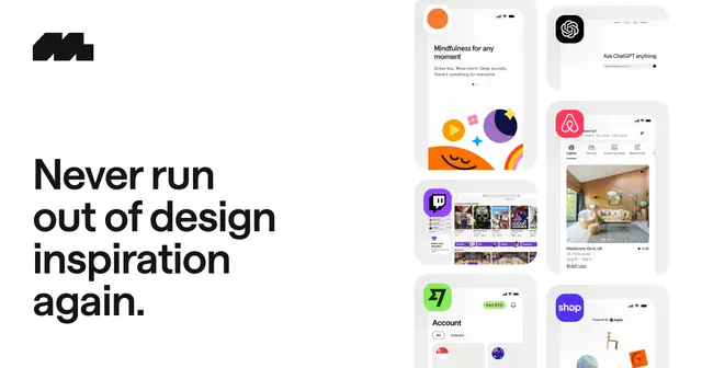
Mobbin
Real-world screens and flows from leading iOS, Android and web apps, searchable by pattern.
The fonts, icons, colors, components and references a UI designer reaches for every week. Start from real product screens, build on a solid kit and type scale, and check contrast before anything goes to handoff.
Real product screens to reference before you start, plus showcases that set the bar for visual craft.
Real-world screens and flows from leading iOS, Android and web apps, searchable by pattern.

Searchable reference library of real web and iOS product screens and flows, updated weekly. Has a Figma plugin and MCP.

200k+ screens, flows and in-context components from 500+ SaaS apps. Search by on-screen text and export to Figma.
SaaS UI and website examples by page type (dashboards, billing, tables, AI pages). Pro adds Figma file downloads.
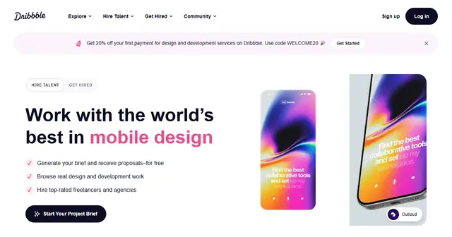
The single best source for UI/UX and graphic design inspiration from designers worldwide.
Adobe's creative showcase and the best place to find full design case studies.

The leading web design awards: daily Site of the Day picks judged by designers, plus collections, courses and jobs.
Choose type, set a scale and build a palette that holds up across light and dark UI.
1,500+ free, widely used font families with variable axes and one-line web embedding.

Quality serif and sans-serif fonts from Indian Type Foundry, free for personal and commercial use.
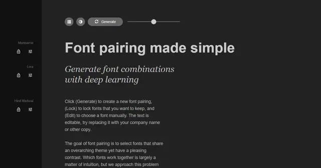
Generate font pairings balanced by the contrast between them, then lock and tweak each pair.
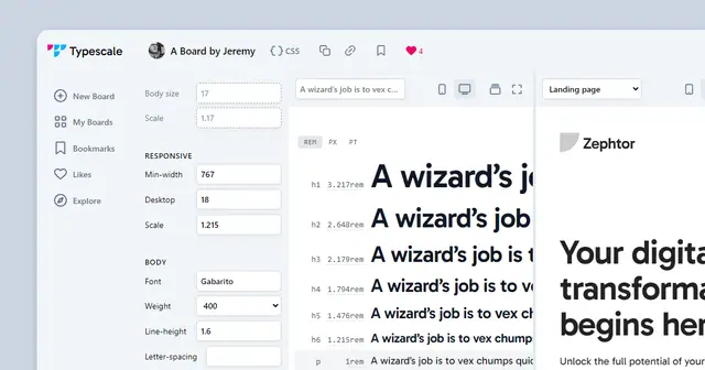
Build a modular type scale from a base size and ratio, preview it with real fonts, and export the CSS.
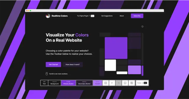
Preview a palette and font pairing on a live website layout, check contrast, then export to CSS, Tailwind or Figma.
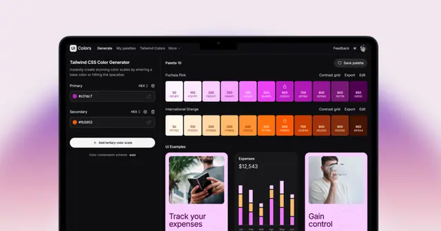
Generate Tailwind-style shade scales from a brand hex and preview them on real UI components. Includes a Figma plugin.
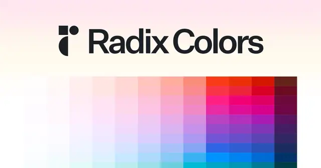
Generate a full Radix-style color scale from your brand colors and preview it on real UI.
Generate tints and shades of any color to build out your design system's palette.
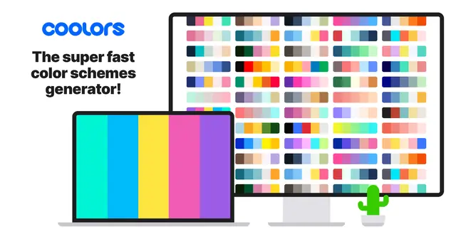
Fast palette generator (spacebar to shuffle) with 10M+ community palettes, image picker, contrast checker and a Figma plugin.
Start from proven components and one consistent icon set, so screens stay coherent as the product grows.

Open-source stroke icon set (1,800+ icons, ISC license) with packages for React, Vue, Svelte and more. The default icons in shadcn/ui.

Flexible open-source icon family in six weights, thin to duotone, with Figma plugin and React, Vue, Swift and Flutter packages.
Search 170,000+ open-source icons from 200+ sets in one place, with each set's license shown. Also available as a Figma plugin.
500K+ open-licensed SVG icons and vectors, searchable and free to download.
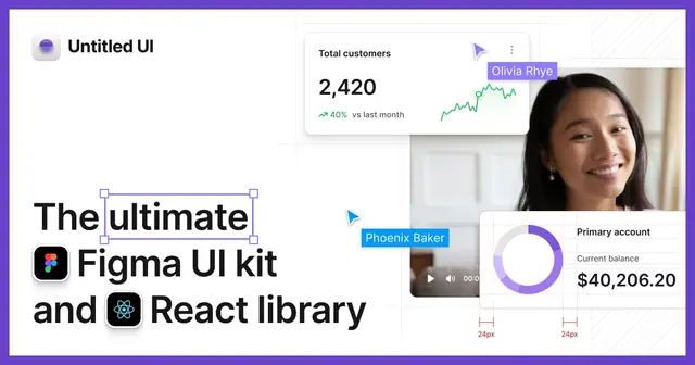
Figma design system with 10,000+ components and variants, a matching open-source React library and an icon set.

Open-source React components on Radix/Base UI and Tailwind that you copy into your codebase. The baseline for most SaaS UIs.
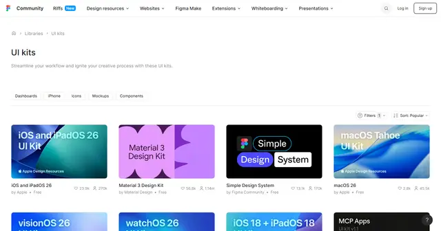
Thousands of free and paid UI kits on Figma Community, including official kits from Apple, Google and Microsoft.
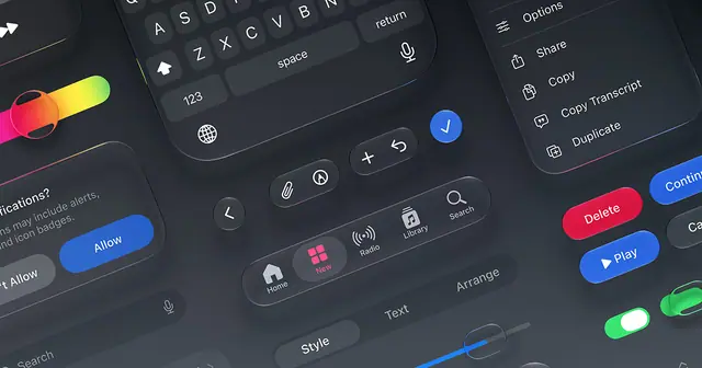
Official Figma and Sketch kits for iOS, macOS, watchOS and visionOS, plus SF Symbols, SF fonts and device bezels.
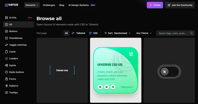
4,400+ open-source UI elements built with CSS and Tailwind, ready to copy into your project.
Check contrast while you design, then hand off clean assets and realistic content.
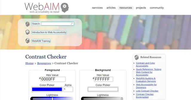
The reference WCAG 2 contrast checker. Enter two colors and get AA/AAA pass or fail for normal text, large text and UI.

Accessibility suite with Figma and Sketch plugins and browser extensions for contrast checks, vision simulation and audits.
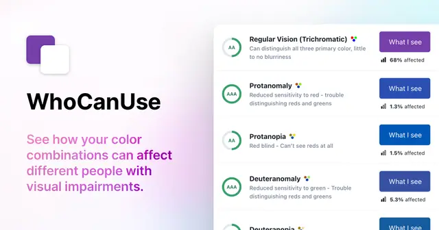
Shows how a color pair reads for people with different vision types, alongside its WCAG contrast grade.

Handoff and documentation layer: publish screens from Figma and developers get specs, assets, styles and code snippets.
Web UI for SVGO. Drop in an SVG, toggle optimizations and export a smaller, cleaner file before dev handoff.
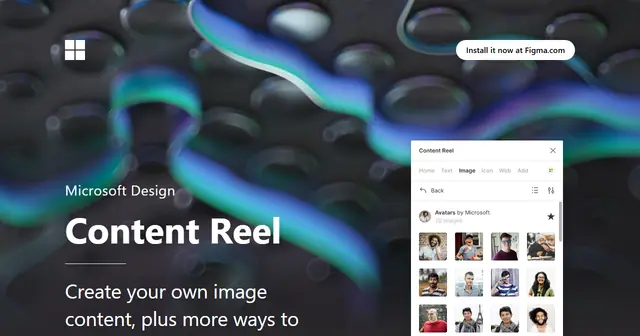
Microsoft's Figma plugin for filling layouts with realistic names, avatars, text strings and icons in one click.
Books and courses focused on the visual side of interface design: spacing, hierarchy, color and type.
Adam Wathan and Steve Schoger's tactical book on making interfaces look polished, from the creators of Tailwind CSS.
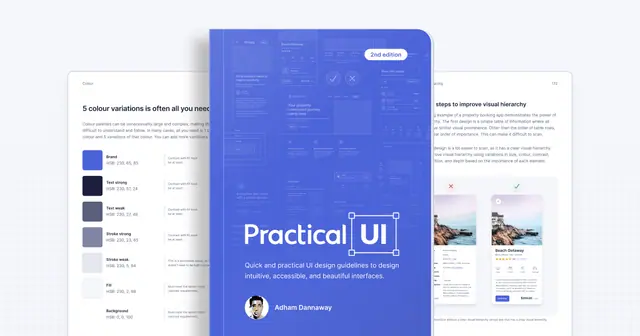
Adham Dannaway's 373-page book of logic-driven UI guidelines, bundled with a Figma design system starter kit.

Erik Kennedy's 36+ hour video course on visual UI design: color, type, layout and more. Opens in enrollment windows.

Matt D. Smith's interface design course built on 16 visual principles. Opens for enrollment periodically.
Weekly newsletter · Every Tuesday
The newest additions to the library, three LDS picks worth revisiting and a category spotlight, in one short email.
Browse past issues